Shaping a confident skincare Identity for the
Youth of Today!
Shaping a confident skincare Identity for the
Youth of Today!
BOD HAVEN
Bod Haven, a youth-focused skincare brand, was gearing up for its big launch. They wanted a bold and energetic brand identity that would stand out, resonate with their audience.
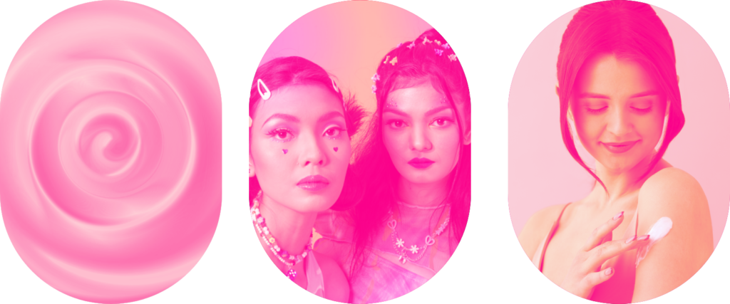
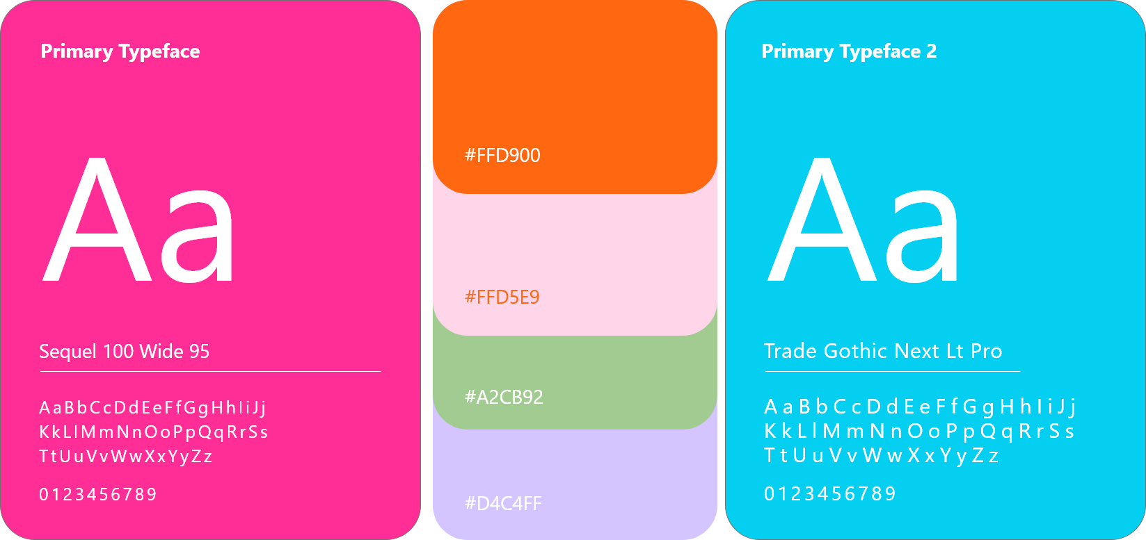
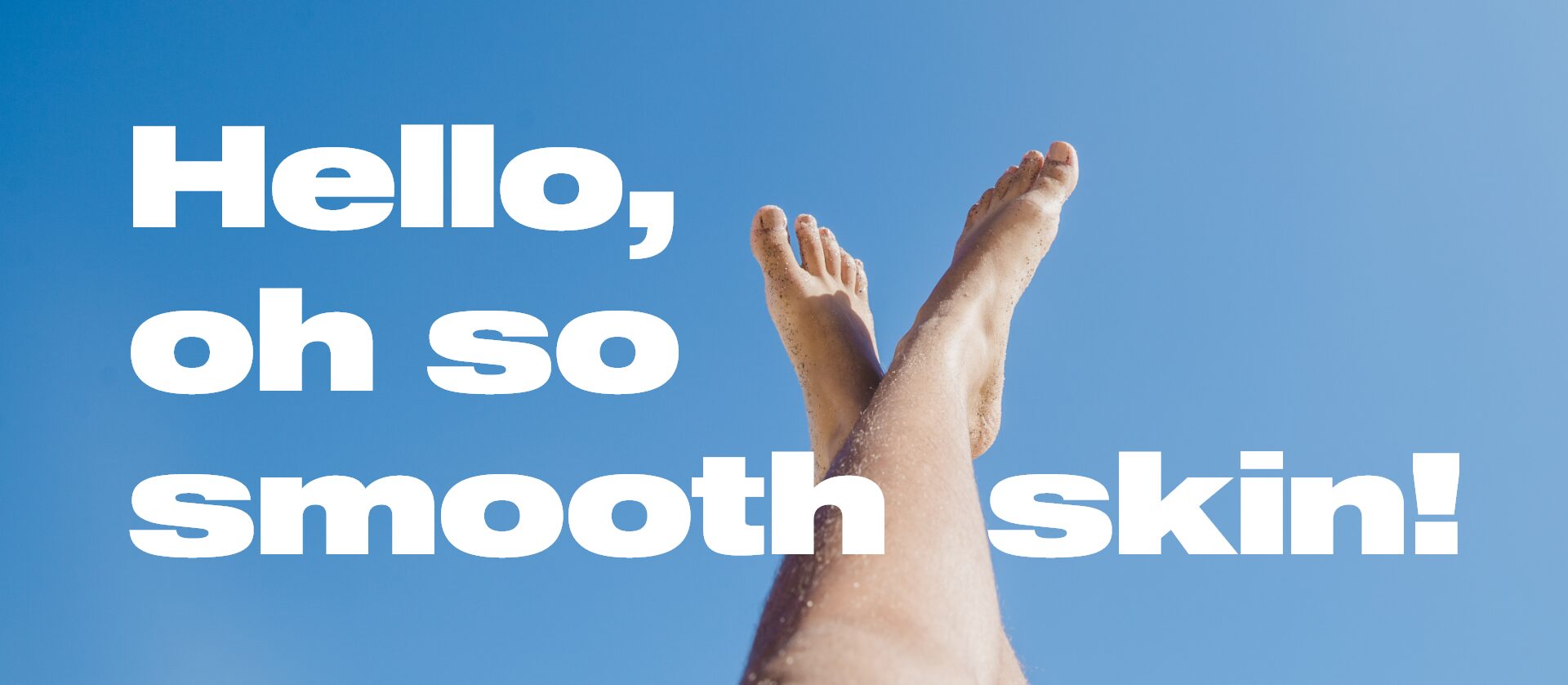
We crafted a vibrant, high-impact brand identity and packaging that speaks directly to the bold, fearless spirit of Bod Haven. A striking color palette of sizzling pinks and oranges paired with cool blues and greens creates an eye-catching aesthetic that demands attention and exudes youthful energy.
Every element, from the design to the messaging, strengthens Bod Haven’s mission to inspire confidence, celebrate individuality, and encourage bold self-expression through skincare.
Services
Branding & Identity
Brand Strategy & Positioning
Marketing Collateral Design
Content Creation
Packaging
Digital Brand Guidelines
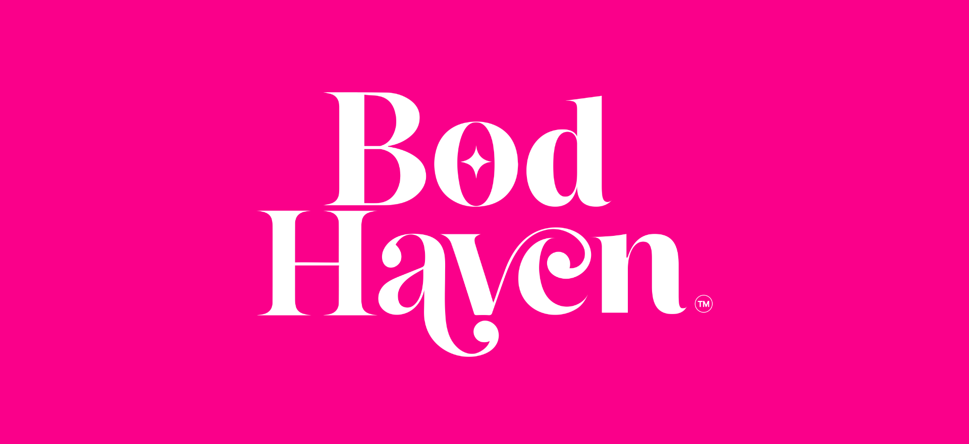
THE LOGO IDEATION
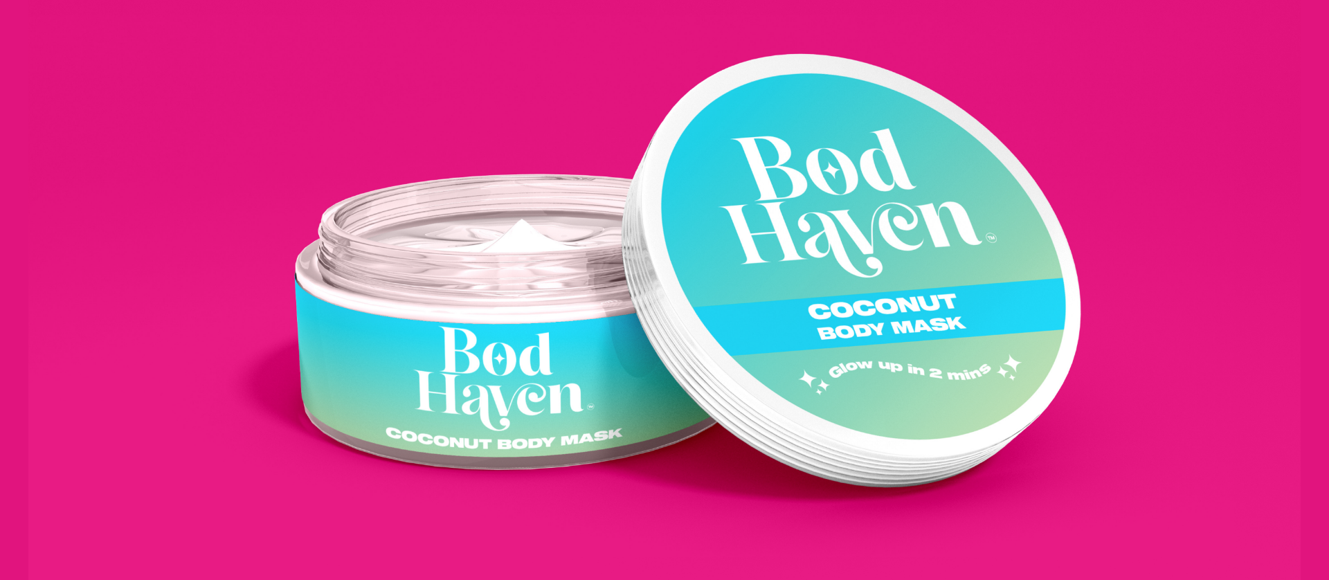
The Bod Haven logo features elegant, flowing typography that mirrors the creamy, smooth texture of the product, creating a sense of softness and luxury. A delicate star symbol is subtly integrated, adding a touch of glamour while signifying the radiant, smooth skin achieved after application. The design embraces a refined yet modern aesthetic, making it perfect for premium skincare branding.
The packaging process
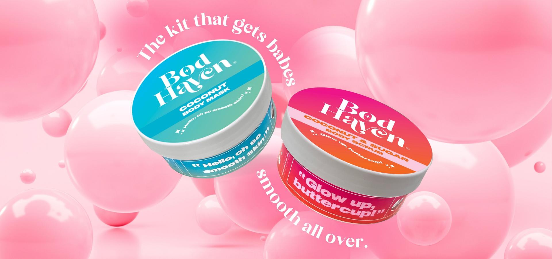
Bod Haven speaks the language of modern, confident women with a catchy, playful tone that feels like a best friend hyping you up. The typography-led packaging is bold yet chic, exuding effortless elegance while inviting young, trend-savvy consumers into a world of smooth, radiant skin. It’s more than skincare—it’s a statement of self-care with a touch of glamour.